Стиль Лофт в интерьере заставляет нас испытывать эмоции, сродни тем, которые порождают музыка либо фото, созданные в жанре индастриал. Корни популярности этого стиля уходят в 40-ые годы прошлого столетия, когда обеспеченная буржуазия переселилась в исторические центры городов, вытеснив разорившуюся аристократию богему на окраины, где процветала адаптация под жилье ненужных фабричных и складских помещений.
Это типично американский стиль – с любовью к большим открытым помещениям, высоким потолкам, огромным окнам, преобладанию металла, стекла и пластика и яркому освещению.
СТИЛЬ ЛОФТ В ИНТЕРЬЕРЕ: АКЦЕНТ НА ПРОСТРАНСТВО
Простейшие варианты отделки в стиле лофт – светлые ламинированные полы, «необработанные» кирпичные стены, деревянные либо каменные потолочные балки, неспрятанные в стену вентиляционные трубы. Зонирование не приветствуется, изолируются только спальни и санузлы.
Оформление стен не терпит декора – кирпичная кладка, окрашенный в белое бетон, ламинированные панели кремовых, серых, пастельных оттенков. В кухне – стальная либо стеклянная плитка, панели из нержавейки.
Контрастное соседство грубой «старой» поверхности и дизайнерской техники последних поколений особенно подчеркивается стеклянными и хромированными подставками под плазменную панель, столиками.
Центральное место занимает многочисленная мебель для сидения – большие диваны, огромные кресла, широкие громоздкие банкетки.
Стиль Лофт в интерьере определяет единственное место, где позволителен кокетливый облицовочный материал – ванная: на полу можно уложить мозаичную плитку, а стены отделать стеклянными панно.
Если необходимость зонировать помещение все-таки есть, например, отделить кухню от гостиной, лучший вариант – стеклянные перегородки.
ЛОФТ – ЛЕГКОСТЬ И НЕЗАЗЕМЛЕННОСТЬ
Огромное помещение не будет казаться пустынным при условии эксклюзивности мебели. Вся мебель, от огромных диванов до компьютерного столика, должна выполнятся по индивидуальному проекту, причем самых неожиданных пропорций. Огромные компоненты мягких гарнитуров можно сочетать с расписной деревянной мебелью, а также обтянутой яркой цветной кожей. Кроме этого, стиль Лофт в интерьере считате уместным мебель на колесиках.
Деревянная мебель выполняется из светлого дерева, хорошо сочетающегося с этническими изделиями, пришедшими из стиля кантри. Это обязательные аксессуары, которые должны присутствовать в том или ином количестве и находится на местах, не сразу попадающих в поле зрения.
Интересно будет смотреться «случайная» вещь – антикварная ванна либо огромный старинный сундук.
Произведениям искусства отведена роль «цветовых пятен», пример – репродукции Энди Уорхола.
Интерьеры в стиле лофт обязаны выглядеть дорогими – это главное требование, предъявляемое качеством стиля. Каждая «недоделка» должна нести на себе след руки мастера.
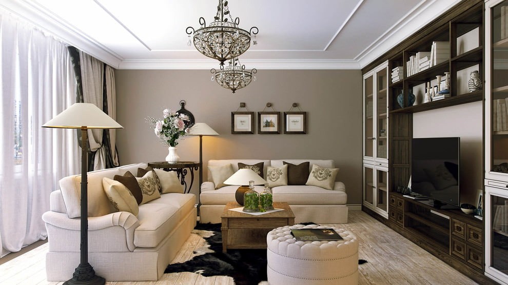
«Склонность к излишествам» – переводится с итальянского слово барокко (испанское «baruecco» – «жемчужина неправильной формы» – так же имеет право на жизнь, ведь криволинейность в интерьере доминирует). На практике стиль барокко в интерьере означает богатство мелкого декора – инкрустаций, золотого шитья, миниатюрнейшей ковки, а также множественные отделки на самых функциональных вещах. Барокко – многослойная пышность, призванная подчеркнуть атмосферу праздности и неги. Стиль, пришедший из дворцов монархов, не может быть иным. Загородный дом – наиболее подходящая для его воссоздания площадь. «Королевская» мебель должна быть симметрична высоким потолкам и окнам.
Речь вовсе не идет о загромождении пространства бесполезными красивыми мелочами. В спальне достаточно ограничиться богатой кроватью без балдахина, стилизованными под старину комодом и банкетками и светильниками и «старинным» зеркалом – атмосферу воссоздадут фрески на стенах, потолочная роспись, декорированный мрамором дверной проем.
БАРОККО – СТИЛЬ ДИНАМИКИ И ПРИЧУДЛИВЫХ ЛИНИЙ
Ценителям барокко незачем приобретать исключительно старинные вещи. Современные технологии позволяют воссоздавать дворцовые отделки, придающие торжественность и объемность повседневным вещам.
Альтернатива настенным фрескам – сюжетные тканые ковры от потолка до пола.
Желая оставить стены однотонными, окрашенными в пастельные тона, не забудьте украсить их лепниной.
Стиль барокко в интерьере придает огромное значение тканям – как портьеры, так и стенные драпировки обязаны изобиловать бахромой и позолоченными кистями.
Живопись и скульптура отдает предпочтение полуобнаженным телам и сценам из сельской жизни.
МЕБЕЛЬ В СТИЛЕ БАРОККО
Наполнение интерьера осуществляется в угоду функциональности, однако с максимальной декоративностью. Аксессуары отходят на второй план, подчеркивая роскошь элементарного.
Обязательный акцент – большие зеркала в лепных либо позолоченных рамах.
Мебель, даже подчеркнуто современная, украшается инкрустациями из меди, серебра, кости.
Кресла и стулья с изогнутыми ножками собираются в группы, являя собой волнистый островок.
Столешница центрального стола – объемна и богато декорирована.
Атмосферу стиля барокко в интерьере воссоздают большие напольные часы, комоды с большими выдвижными ящиками.
Барокко изобилует мелочами, но не любит бесполезности. Стилизованная под старину расческа, «забытая» у зеркала – тоже акцент интерьера.
Респектабельность и пышность присутствуют в повседневном быте людей, выбирающих стиль ампир в интерьере. Для реализации замыслов в этом стиле нужны большие площади. Согласитесь, массивные кресла с накладками из позолоты либо бронзы, шкафы, украшенные резьбой в виде скрещенных мечей и стулья с ножками в виде лап льва или грифона, собранные на небольшом пространстве, будут напоминать лавку древностей, но никак не помпезную столовую либо гостиную.
СТИЛЬ АМПИР В ИНТЕРЬЕРЕ – ПОДЛИННОСТЬ, ДОСТОЙНАЯ ЗАВОЕВАТЕЛЕЙ
Мебель и длинные тяжелые портьеры определяют наполнение апартаментов. Стиль, особенно ценящий симметрию, подчеркивается продуманным «парадом» голов и лап львов, сфинксов, лебедей, утилитарное назначение которых – поддерживать либо увенчивать ножки и подлокотники диванов и кресел.
Элитная фактура древесины – обязательное отличие мебели в стиле ампир, ее не скрывает резная орнаменталистика в виде «имперской» символики (шлемы, щиты, лавровые венки).
Стиль ампир в интерьере накладывает ограничения на силуэты – прямые либо слегка изогнутые ножки стульев и банкеток, спинки в виде лир, колонны в качестве косяков шкафов и буфетов. Круглая форма дозволена лишь обеденному столу.
Узкие застекленные серванты могут наполняться лишь помпезными сервизами и массивными статуэтками на военную и историческую тематику.
Продуманная симметрия сама по себе становится акцентом интерьера ампир. Общий вид помещения не должен вызывать желания перемещать вещи с места на место.
Ковры ручной работы, массивные зеркала и напольные вазы обязательно дополняются живописными произведениями в пышным рамах.
СТРОГОСТЬ И КАМЕРНОСТЬ СТИЛЯ АМПИР
Важно происхождение использованных в базисных конструкциях материалов.
Полы следует стелить из карельской березы, туи, палисандра, в ванной – уместнее мрамор.
Украшенные колоннами стены выкладываются мрамором, обшиваются обоями на основе парчи либо шелка, в тон обивке оформляется мягкая мебель и объемные абажуры.
При воссоздании стиля Ампир в интерьере, потолки украшаются лепниной, фресками, более скромный вариант оформления – медальон.
Филенчатые двери вытягиваются по длине и забираются в порталы.
Окна (пластиковые исключены) убираются во французские шторы из плотной тяжелой ткани.
В палитре доминируют чистые синий, голубой, красный, белый, охровый тона, обильно сдобренные бронзой и позолотой.
Кухня в стиле ампир намекает на уютную интимность плавными изгибами стульев, спальня – объемной кроватью под пышным балдахином, возвышающимся над остальными предметами мебели.
Минимализм здесь неуместен, – как и мелкий незатейливый декор. Не стоимость, а пышность вещи должна бросаться в глаза посетителю, вне зависимости от того, заглянул он в кабинет или в спальню.
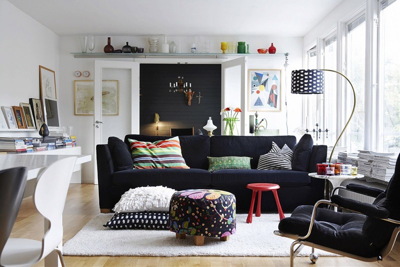
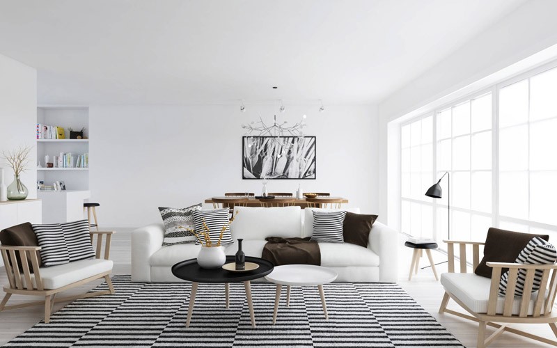
Психология викингов изначально была ориентирована на надежность и добротность среды обитания, что, конечно же, отразилось и в интерьерах. Поэтому скандинавский стиль в интерьере – это функциональные деревянные конструкции, облагороженные умеренным декором, лаконичная природная красота материала, самобытность оформления стен и потолка, сочетающего простоту и контрастность.
Скандинавский стиль в интерьере гостиной
Интерьер, выдержанный в скандинавском стиле, необязательно должен выглядеть суровым, особенно, если это спальня или кухня. Умеренность декора не означает отсутствие интересных сочетаний и форм.
СКАНДИНАВСКИЙ СТИЛЬ В ИНТЕРЬЕРЕ – ПРОДУМАННОСТЬ И СТРОЙНОСТЬ Не в последнюю очередь линейность и прозрачность интерьеров, выполненных в скандинавском стиле, задается обилием светло-акварельных густых тонов – терракотового, светло-шоколадного, белого. Стены, покрытые однотонной (возможно, рельефной) штукатуркой, – единственно возможный вариант.
Скандинавский стиль в интерьере
Скандинавский стиль в интерьере подразумевает открытую планировку – смежные комнаты, широкие дверные проемы. Яркие акценты – бордовый, вишневый, алый – в виде вкраплений-узоров на занавесках и обивках. Окна предназначены для максимальной эффективности дневного освещения – легкие кисейные занавеси без дополнительных тяжелых штор. Светлую палитру продолжают напольное покрытие – половая доска из светлых пород дерева с сохранением текстуры либо – белая глянцевая, и мебель из светлых пород дерева – выбеленной березы либо сосны.
СТРОГАЯ РЕСПЕКТАБЕЛЬНОСТЬ ПО-СКАНДИНАВСКИ Мебель, несмотря на свою практичность, может быть многочисленной – стулья, шкафчики разных размеров, сундуки. Нарядная посуда из хрусталя, выставленная «напоказ», собирается в одном месте на полках вместительного серванта.
Скандинавский стиль в интерьере: детали
В гостиной и спальне приветствуются добротные вещи – всю изысканную мебель, доставшуюся в наследство от прошлых поколений, скандинавы отправляют на кухню, выполненную, чаще всего, с элементами ретро. Мебель, в т.ч. спальня – раскладная, обязательно с выдвижными ящиками для вещей. Забавные мелочи – сердечки, раковины – в обилии представлены в ванной. Обивка мягкой мебели напоминает о близости моря – ткани в синюю и голубую полосочку и клеточку, узоры цвета морской волны (популярная расцветка – райские птицы, олени, елочки, морские раковины). Аксессуары можно пересчитать по пальцам – несколько фотографий в плетеных рамках, развешанные на стенах керамические рыбки. Пластиковые, деревянные, окна на балкон
Скандинавский стиль в интерьере отличается отсутствием предметов, которыми можно подолгу любоваться – картин в старинных рамах, антикварных вещиц и т.д. Комфорт хозяев прочитывается куда более выразительно, нежели желание поразить гостей.
Понятие «американского» стиля в интерьере достаточно размыто: для некоторых это воссоздание колониальной атмосферы, для других — это что-то среднее между арт-деко и контемпорари, для третьих — это просто работы американских дизайнеров. Именно американский интерьер, несмотря на бытующий стереотип о том, что для него требуются огромные площади вроде Тары из «Унесенных ветром», в наибольшее степени подходит огромному количеству современных квартировладельцев, которым хочется объединить в интерьере бабушкин буфет, классицистский шкаф-купе и очаровательный пластиковый комодик в цветочки.
Американский стиль интерьера, как и все американское, воплощает в себе гибкость и демократичные ориентиры, позволяющие отойти от шаблонов. Как никакой другой, он лоялен к привычкам и пристрастиям владельца, а также к очевидным имитациям.
СВОБОДНОЕ ПРОСТРАНСТВО КАК АКЦЕНТ СТИЛЯ
Формирование интерьера в американском стиле обязательно должно включать в себя проектирование систему вытяжки и вентилирования, т.к. отсутствие глухих перегородок между жилыми помещениями и кухней – его условие. По сути, в американских интерьерах изолированы только спальни.
Главная узнаваемая черта американского интерьера – множество ниш, арок и фальш-перегородок, задачей которых является визуальное зонирование вкупе с созданием потайных уголков для хранения чего-нибудь, например, коробки с рабочими бумагами. Неслучайно говорят, что даже маленькая американская квартира напоминает студию.
Ликвидация перегородок между гостиной и кухней либо гостиной и прихожей может быть выполнена частично – за счет светопрозрачных перегородок либо невысоких стоек.
Потолочная люстра в американском интерьере уместна лишь в гостиной и столовой.
В спальнях и детских на локальное освещение возлагается роль зонирования локальных мест, отсюда обилие настольных и декоративных ламп, торшеров и бра – практически над каждым посадочным местом.
Мебель для сидения располагается по центру комнат, стены убраны в многочисленные стеллажи и полки, на которых расставлены не менее многочисленные сувениры: изобилие мелких декоративных предметов отличает американские интерьеры.
АМЕРИКАНСКИЙ СТИЛЬ – ИМИТАЦИЯ ДОРОГОВИЗНЫ
Английские чопорность и респектабельность изначально сочетались в американском стиле с ирландской простотой и пестрой непритязательностью жилищ коренных жителей континента. Решив обустроить интерьер в американском стиле, вы можете отказаться от натурального дерева в пользу МДФ, заменив натуральный камень имитацией на керамической плитке.
Мебели в американском интерьере неизменно много – многочисленная мягкая мебель, шкафы, комоды, столики, при этом все предметы должны размещаться по островному принципу и на достаточном расстоянии друг от друга., по этой причине и сносятся перегородки.
Кухонная мебель – деревянная, белая либо светлая, обязательно размещенная по центру помещения в виде острова. На виду – вся бытовая техника, от кофеварки до большой посудомоечной машины.
Пол из плитки либо паркетной доски принято сочетать с обшивкой стен МДФ-панелями.
Центральное место в американских квартирах отводится столовой – помимо обеденного стола, размещенного на стыке рабочей о гостевой зон, обязательно присутствуют барная стойка и кофейная группа, в большом холле для пати их может быть даже несколько.
Украшается такая столовая кованными люстрами и картинами – объемными натюрмортами и пейзажами.
Цветовая палитра столовой – яркая мягкая мебель на фоне нежно-пастельных стен.
Окна в американском стиле занавешивать не принято, однако большое внимание уделяется декору рам. Можно использоваться боковые прямые портьеры либо римские шторы.
Мебель в американском стиле приветствуется с мягкой тканевой или кожаной обивкой, с которой сочетается плетеная мебель.
В ванной комнате у американцев принято устраивать подиум либо ставить ванну на ножки, стены можно оформить ажурно – выложив мозаичной плиткой либо просто –обшив окрашенными панелями.
Обязательное условие американской ванной – большое окно. В обычной квартире его можно заменить фальш-окном из зеркального стекла, разместив по бокам большие бра.
Правила американской спальни – темная высокая кровать, светлые стены, ковролин или пушистый ковер на полу, большие пастельные картины в качестве украшения.
С точки зрения европейцев американский интерьер слишком эклектичен, а также не знает границ в смешении текстур, однако сами американцы гордятся возможностью устроить «мексиканский уголок» посреди английской гостиной, укрыв диван лоскутным пледом и набросав на строгий ковер пестрых подушек.
Одна из самых распространенных ошибок, которую делают люди — загромождение помещения слишком большим количеством вещей. Захламление может сделать комнату визуально меньше размером и создать ощущение беспокойства у живущих в ней людей. Ликвидация бесполезных предметов, которые вы редко (или никогда) используете, даст больше жизненного пространства. Можно избежать загромождения, покупая только те вещи, от которых вы просто в восторге и которые, вы считаете, имеют важное значение для интерьера.
Выбор цвета окраски помещения до того, как выберете мебель
Цвет всегда будет одним из самых важных решений в процессе планирования интерьера. Не спешите. Стол или диван можно легко перемещать по квартире, но краска — уже совсем другая история. Будет лучше сначала выбрать мебель и другие аксессуары для комнаты, а затем взять куски ткани от них и подобрать цвет, который подойдет лучше всего.
Плохое освещение
Каждый интерьер может хорошо выглядеть в темноте, но что происходит, когда вы включаете свет? При разработке дизайна своей квартиры не упускайте из виду одну из наиболее важных особенностей. Вы увидите, что освещение может как украсить, так и разрушить вашу задумку. Оно создает эмоции и ощущения. Вы же не хотите, что комната была такой яркой, чтобы вы чувствовали себя в эпицентре разряда молнии? В то же время скудное освещение придаст мрачный вид комнате. Существует огромное количество различных светильников на выбор, не бойтесь провести небольшое исследование!
Сочетание цветов
Цвет комнаты определяется не только цветом стен. Тона и оттенки мебели будут сильно влиять на настроение. Например, не обязательно использовать красный цвет во всех предметах и окраске стен, если вы хотите получить красную комнату. Можно добавить контрастов в схему окраски. Большинство магазинов имеют образцы цветовой палитры, которые помогут вам выбрать лучшие цвета и их сочетания для вашей комнаты.
Избыток мебели
Ваш дом отражает состояние вашего ума. Нахождение в комнате, которая переполнена журнальными столиками, кушетками, пуфами, шкафами, коробками или какими-либо еще предметами мебели, может привести к ощущению дискомфорта. Оставьте пространство для того, чтобы по комнате можно было свободно перемещаться. Не обязательно заполнять мебелью пустое место, оставьте немного воздуха. В такой комнате будет намного проще расслабиться и отдохнуть.
Выбор неправильной высоты при украшении комнаты предметами искусства
Другая ошибка, которая часто наблюдается при оформлении интерьера: картины висят на неправильной высоте, которая является либо слишком низкой, либо слишком высокой. Важно не только выбрать элегантные произведения искусства, которые дополняют стиль комнаты. Правильные пропорции также важны для оформления внешнего вида стен. Комната будет выглядеть приятнее, да и впечатление от нее у гостей и хозяев дома улучшится.
Дизайн интерьера – это просто. Надо лишь представить, чего бы вы хотели. Но просто представить не каждому по силам.
Правило 1. Мир «студиям», война «клетям».
Дело даже не в размерах помещения, а в том, какое впечатление они производят. Сложные конструкции, многочисленные декоративные украшения, обилие гипсокартонных элементов и лепнины зрительно уменьшают помещение, «перегружают» его, притягивая к себе внимание, и потому быстро надоедают.
К тому же, все эти «гроздья» на стенах и потолке стоят немало, а из моды выходят быстро. Современный мир склоняется к минимализму – просто и недорого. А главное – светло и просторно, легко дышать и ничто на тебя не давит.
Правило 2. Лучше меньше, да лучше.
«Воздушность» и легкость восприятия создается и за счет цвета. Не бойтесь белого! Некоторые все еще считают его по старинке «больничным». Неправда! Белый может быть очень уютным, «мягким» и ласковым, создавая ощущение свежести и чистоты. Что ни говорите, белый – это классика!
Последний «писк» – сероватый микроцемент, когда стена выглядит будто «недоделанной», имитируя различные фактуры бетона. Приверженцам строгой классики, скорее всего, микроцемент покажется «диким»: мол, новостройка какая-то еще необжитая.
Но молодежь и те, кто не боится новизны, по достоинству оценят экономичность такой отделки, ее высокую износоустойчивость и простоту в обращении: можно бить-мыть-пачкать – все нипочем.
Правило 3. «Дружат» – все!
Как в одежде сегодня модны «сочетания несочетаемого» (легкой юбки с кедами, кружев с джинсами и так далее), так и в интерьере – соединять можно все. На смену «выдержанности стиля» приходят полистилистика и даже эклектика, особо популярными становятся союзы принципиально разных, казалось бы, материалов: дерева с металлом, камня со стеклом и тому подобное.
Предпочтение отдается натуральным природным материалам, экологически безопасным. Конечно, они дороже более дешевых синтетических, но из моды не выходят. А главное – здоровью не вредят.
Правило 4. Не закатывайте деньги в стены.
На Западе давно уже не обращают особого внимания на идеальность стен. В конце концов, даже дырку можно прикрыть яркой картинкой. Да и на потолок мы смотрим лишь тогда, когда он чем-нибудь украшен.
Так что деньги лучше потратить не на «коробку», а на удобство самой среды обитания. И в первую очередь – на хорошую качественную мебель, сантехнику, освещение. Интерьер должен быть комфортным. А главное – создавать настроение!
Правило 5. Три в одном.
Современная модульная мебель позволяет легко изменять пространство, приспосабливая его к той или иной жизненной ситуации – например, приходу гостей.
Интерьер предстанет совершенно иным, если в нем изменить хотя бы несколько деталей (что при модульной мебели также несложно). Хочется новизны — меняйте цвет. Подушек, штор, декора, даже скатерти за праздничным столом. И вместо одного интерьера (как говорят, на все случаи жизни) вы будете иметь два, три – сколько захотите.
Правило 6. Мебель тоже может быть «умной».
Современная мебель – это не просто мягкое кресло или удобный диван. Новейшие технологии позволяют двигать и трансформировать самые разные элементы интерьера, даже перемещать розетки по специальным «рельсам» или сооружать «выездные» кровати и шкафы, которые потом легко спрятать в стене.
Такая мебель помогает при надобности кардинально изменять интерьер, ничего не вкладывая.
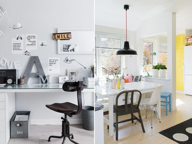
Правило 7. «Шарфик» для квартиры.
Интерьер, как и человек, должен быть уникальным и неповторимым. И в трафаретный ремонт можно «вдохнуть живую жизнь». Так, если «фишкой» в женской одежде часто становится шарфик или какой-либо другой аксессуар, то в современном интерьере особую ценность приобретают дорогие сердцу «безделушки», с которыми многое связано.
В минималистичный дизайн (см. правило 1) легко вписать любую колоритную деталь, даже старый бабушкин сундук. Подобные «коллекционные» вещи, связанные с личностями жильцов, придадут интерьеру особый шарм.
Ну и, наконец, главный закон, которому должны подчиняться предыдущие семь. Любое правило – не самоцель. Оно лишь метод в достижении цели. Поэтому фантазируйте, придумывайте, воплощайте. И если не совсем уверены в себе, проконсультируйтесь у специалиста. Чтобы выстраданный вами идеал не оказался при воплощении смешной «самоделкой».
Одна из самых топовых дизайнеров интерьера снова возвращается на телеэкраны и занята как никогда. Среди ее клиентов Виктория Бэкхем и Кейт Миддлтон, но между тем Келли делится основными секретами
Келли Хоппен (Kelly Hoppen) относят к числу одних самых топовых дизайнеров интерьера. Ее стиль можно назвать элегантным, где-то сдержанным, но обязательно не лишенным вкуса. Возможно, именно поэтому к ней обращаются поклонники спокойного и лаконичного интерьера, к примеру, среди них есть такие знаменитости как Виктория Бэкхем и Кейт Миддлтон.
Помимо частных резиденций и апартаментов в портфолио Келли можно увидеть и коммерческие проекты для гостиниц и ресторанов, а также интерьеры яхт, гольф-клуба.
Дизайнер сотрудничает и с девелоперскими компаниями, создавая готовые интерьерные решения для респектабельных комплексов апартаментов.
Богатый опыт Келли позволил ей не только выработать свой стиль, но и поспособствовал выпуску книг с ее советами, как лучше обустроить свой дом. Существует целый ряд так называемых золотых правил, которые могут пригодиться любому неравнодушному. С некоторыми из них мы сегодня и ознакомимся.
1. Вкус
О вкусах и предпочтении стиля не спорят. Все индивидуально, поэтому главное — исходить из собственных пожеланий и базироваться на том, что подходит именно вам.
2. Концепция
Важно продумывать интерьер с самого начала, потому как неудобная планировка вряд ли будет спасена, если вы просто прибегнете к использованию дорогих материалов и мебели.
3. Освещение
Освещение – один из самых мощных инструментов, который способен изменить атмосферу и визуальное восприятие любого пространства.
4. Сочетание
Вы всегда будете в выигрыше, если будете смешивать и сочетать как дорогостоящие, так и дешевые материалы.
5. Акценты
Определиться с акцентным центром комнаты бывает порой нелегко. Однако это должен быть какой-то один предмет — например, необычное кресло, причудливой формы светильник или торшер, а может, и винтажный комод.
Влияние красного, оранжевого, желтого, оранжевого, желтого, зеленого, синего, голубого, фиолетового, белого, черного, розового, лилового (лавандового) цветов на человека.
Секреты по влиянию цветом на физическое и психоэмоциональное состояние.
Рассмотрим несколько методик, как влияют цвета на человека.
Практически ни для кого уже давно не секрет, что успех в жизни зависит от правильно поставленных целей. Ставим цель, затем продумываем мотивацию, чтобы эту цель достичь, и постепенно идем к ней. Выглядит довольно просто, но все равно многие люди не добиваются успеха, хотя хорошо знают схему. Вполне вероятно, что проблема заключается в отсутствии воздействия на визуальные центры. Существуют особые цветные стимулы, которые непосредственно влияют на энергетику. Воздействие на эти стимулы называется цветотерапией. Наука появилась достаточно давно, она дает положительный результат при стремлении к мечте.
Не стоит недооценивать влияние цвета на человека. Порой цвет стимулирует возникновение определенных реакций, которые могут сказаться на принятии решений. Цвет воздействует на аппетит, на давление. Обычно мы не замечаем влияние цвета. Но, например, в пасмурный день, когда за окном мы видим только серость, настроение сразу начинает ухудшаться. Положительная энергетика пропадает, а окружающий мир вдруг становится неприятным и враждебным.
Современная медицина только недавно обратила внимание на цветотерапию. Суть этой методики – использование цвета в качестве способа воздействия на психическое, эмоциональное и физическое состояние человека. Основа методики – длина волны у каждого цвета. Разная длина волны оказывает разное действие на человеческий организм. В этой статье мы детально разберем влияние различных цветов на состояния человека и дадим советы по конкретному использованию каждого из них.
Влияние красного цвета на человека
Красный и алый цвет – это насыщенные оттенки. Они позволяют сдвинуться с мертвой точки, повысить тонус, получить заряд бодрости и активности, ощутить прилив сил. Если вы не можете принять верное решение, боитесь осуществить задуманное, то именно красный цвет избавит вас от всех сомнений, поможет быстрее сделать правильный выбор. Вы сумеете правильно расставить акценты, более ясно посмотреть на ситуацию, оценить приоритеты. Красный цвет придаст сил для борьбы за свое мнение и за свою точку зрения. Даже если вы считаете, что все тлен, жизненные силы покинули вас, то красный сможет все изменить к лучшему. Вы быстро встанете на ноги, обретете бодрость и силу духа.
Красная чакра прибавляет силы и выносливости людям. Причем рост, вес и другие физические данные не имеет значения, даже невысокие и хилые с виду люди проявляют необыкновенные способности. Это заметно окружающим, обычно с такими людьми не вступают в споры, не создают конфликтных ситуаций, так как отмечают, что перед ними стоит лидер. Но чрезмерная активность красной чакры может негативно сказываться на поведении. Появляется агрессия, излишняя вспыльчивость. Люди становятся нетерпимыми, чаще ревнуют. Слишком сильная активность влияет и на другие энергетические центры, поэтому человек не может достичь цели. Ведь на пути к мечте недостаточно только красной чакры, необходимо воздействие и других стимулов. Красный цвет нужно использовать в меру. Лучше всего, по мнению специалистов, красный цвет действует утром. Он помогает проснуться и зарядиться энергией на весь день. Также этот цвет может применяться в ситуациях, когда нужно взбодриться, наполниться решительностью и амбициями. Положительное влияние красного цвета на человека отмечают и историки. Многие средневековые гербы и флаги используют в своей символике этот цвет. Он показывал военную мощь, стремление к завоеваниям и победам. Причем цвет влияет не только на успехи в военном деле. Он также связан с эротической сферой, со страстью и любовью. Красный цвет – это символ настойчивости, активности, силы и опасности.
Красный также положительно влияет на организм человека – стимулирует кровообращение, улучшает обмен веществ, работу сердечнососудистой системы, иммунитет. Эффект от красного можно заметить после долгой прогулки на холоде. Если вам нужно срочно согреться, то нет ничего лучше красных шерстяных носков. Этот цвет выбирают люди с пониженным давлением, нарушениями кровообращения. Но если давление повышено, то лучше исключить красный. Это же касается различных кровотечений. В таких ситуациях стоит использовать минимум красного или вовсе заменить его оранжевым цветом.
Влияние оранжевого цвета на человека
Оранжевый цвет – активный и деловой. Он символизирует карьерный рост и успехи в бизнесе. Оранжевый обладает собственной особой теплотой и энергией. Он просто лучится позитивом и оптимизмом. Его использование благоприятно сказывается на работе мозга, стимулирует активную деятельность, творчество. Оранжевый вляет на концентрацию внимания. Он играет важную роль во время ведения переговоров, ведь с помощью оранжевого цвета легче устанавливается диалог с собеседником. Вы сможете расположить к себе любого. Основные ассоциации – это лидерство, смелость, приключения, жизненный тонус. Его нужно использовать при работе в области торговли, недвижимости и права.
Выбирайте оранжевый цвет, если хотите постоянно находиться в хорошем расположении духа, снять стресс и раздражительность, улучшить работу мозга, поднять свои волевые качества. Влияние оранжевого цвета на человека поспособствует установлению дружеских отношений с другими людьми, сделает вас более ответственными.
Не каждый принимает естественность этого цвета. Но зато оранжевый является самым безопасным, для него нет противопоказаний. Поэтому можно без проблем применять его в жизни. В организме человека положительное влияние оранжевого цвета испытывает эндокринная, дыхательная и пищеварительная системы. Цвет сказывается на работе всех гормонов. В биоэнергетике оранжевый – это «основной инстинкт», к которому человек переходит после «самосохранения» красного. Таким образом, пробуждение второй чакры происходит во время полового созревания. Вторая чакра отвечает за все вопросы, связанные с сексуальностью и семьей, начиная от полового акта, заканчивая инстинктом защиты собственного потомства. Если вы собираетесь создать семью, то окружите себя оранжевым цветом. Еще одно положительное влияние цвета на характер человека – повышение чувства собственного достоинства.
Влияние желтого цвета на человека
Основные ассоциации желтого – это ум, знания, мудрость, самодостаточность, плодородие и зрелость. Этот цвет придает энергии, оптимизма, успокаивает и расслабляет. Именно желтый носит название интеллектуального цвета. Он положительно сказывается на памяти, творческой деятельности, способствует мыслительному процессу.
Но существует множество оттенков желтого, все они оказывают различное влияние на человека. Взять, например, лимонный и медовый. Медовый оттенок является более зрелым, не каждому он по душе. Ведь он ассоциируется с осенью, с вечером. Поэтому некоторые люди плохо воспринимают медовый цвет. А лимонный ассоциируется с осенью и утром, поэтому может оказывать противоположное влияние. Хотя цвета и похожи, по своему воздействию они отличаются. Лимонный цвет улучшает настроение, положительно влияет на мозговую деятельность, придает заряд бодрости и позитива.
Влияние желтого цвета на человека испытывает нервная система. Его сфера – это правое полушарие, которое отвечает за творчество. С помощью желтого можно развивать свои таланты, этот цвет позволяет улучшать работу мысли. Как и оранжевый, цвет влияет на пищеварительную систему, но немного с другой стороны. Он работает с кишечником, отвечает за усвоение полезных веществ и пищи, особенно за усвояемость кальция. Если желтого недостаточно, то это может вызывать обострения заболеваний опорно-двигательного аппарата. Цвет благоприятно сказывается на здоровье кожи, возвращая ей мягкость и упругость. Но желтый цвет не стоит использовать при бессоннице.
Лучше не окружать желтым цветом маленьких детей, они реагируют на него негативно – начинают плакать. Также лучше не использовать его в качестве основного цвета стен в комнате. Иначе вы рискуете постоянно терять контроль над собой. Желтый цвет плохо влияет на сдержанность.
Влияние зеленого цвета на человека
Главная цель зеленого цвета – это сохранение богатства и процветания. Останавливаться лучше на теплых оттенках. Сочный зеленый цвет помогает избавиться от тревожности, волнений. Цвет оказывает освежающее действие, позволяет сохранять бодрость и оставаться в тонусе. При появлении долгосрочных планов обязательно используйте зеленый. Например, если вы собираетесь сесть на диету или регулярно заниматься спортом, то зеленый цвет окажет вам необходимую поддержку. То есть, он влияет не на результат, а на сохранение уже имеющихся достижений. Много зеленого может работать как снотворное, полностью расслаблять организм. Но лучше избегать воздействия этого цвета с утра. Утром нужна бодрость, а зеленый будет тянуть вас к релаксации. Однако это влияние цвета на психику человека обуславливается еще и индивидуальными особенностями темперамента. Слишком много зеленого также производит негативный эффект – появляется тоска и апатия.
Естественно, что зеленый — это природа. Только здесь можно увидеть такое обилие этого цвета. Поэтому, если вы испытываете недостаток зеленого, то просто погуляйте по лесу. Также можно выбрать зеленые лампы в спальне или постельное белье этого цвета. Зеленый цвет улучшает зрение и повышает аппетит, положительно сказывается на работе мозга и концентрации внимания. Влияние зеленого цвета на человека позволяет избавиться от плохих мыслей и негативных эмоций. А это уже улучшает работу сердечнососудистой системы. Ведь именно плохое расположение духа и нервы способствуют появлению болезней сердца и сосудов. Зеленая чакра в биоэнергетике связана с альтруистическим подходом, бескорыстной любовью и восхищением. Вы сможете позитивно принимать весь мир. Если зеленая чакра развита хорошо, то человек становится душой компании. А недостаток зеленого связывают с проблемами дыхательной системы, сложностями в общении и установлении отношений с противоположным полом. Слишком мало зеленого – это причина появления аллергических реакций.
Влияние синего цвета на человека
Активность – это, конечно, хорошо. Но гиперактивность часто приводит к проблемам. Чересчур импульсивным людям сложнее общаться с остальными, их энергия может навредить. Именно для таких людей и существует синий цвет. Он успокаивает, уравновешивает, контролирует. Вы сможете научиться управлять своими эмоциями, приобрести необходимую невозмутимость. Гиперактивность сократится, не будет достигать катастрофических масштабов. Через какое-то время вы сможете полностью контролировать свой темперамент и действия. Влияние синего цвета на человека улучшает концентрацию внимания. Чрезмерная импульсивность зачастую сказывается на работе нервной системы, причем сказывается не лучшим образом. Но синий цвет способен справиться с этими проблемами. Ваш разум станет свеж и ясен. Также этот цвет увеличивает уверенности в себе.
Как и в случае с другими цветами, синий имеет множество оттенков с разными эффектами. Насыщенный синий – это спокойствие, миролюбивость и безмятежность. Темно-синий считается более тревожным и депрессивным цветом. Он может вызывать беспокойство. Чрезмерное психологическое влияние цвета способно исказить реальное представление, погрузить человека в мир иллюзий. Синий является синонимом меланхолии. Атмосфера безмятежности, которую он несет, сходна с консерватизмом. Если человек по натуре меланхолик, то ему лучше не использовать синий цвет. Альтернативной ему могут стать желтый или оранжевый.
Синяя чакра влияет на умственную деятельность человека, отвечает за интеллект, анализ и логику. Чакра этого цвета означает, что человек спокоен и дисциплинирован. Причем дисциплинирован не только внешне, но и внутренне.
Синий – холодный цвет, поэтому он оказывает успокаивающее влияние на организм человека. Он помогает справиться с высоким давлением или температурой. Слишком много синего воздействует на гормоны. Цвет схож с зеленым, он успокаивает и расслабляет. Чрезмерное воздействие этого цвета может навредить, поэтому в биоэнергетике часто синий заменяют на голубой. Цвет благоприятно сказывается на здоровье маленьких детей. Если у ребенка режутся зубки, то голубой – это идеальное решение. Также голубой может препятствовать воспалениям и бессонице. Регулярное использование голубого цвета расслабляет, избавляет от усталости. Он действует лучше, чем зеленый, но при этом не имеет противопоказаний. Но если использовать голубой цвет в больших количествах, то он тоже может навредить.
Влияние голубого цвета на человека
Голубой цвет – это сочетание синего и белого, поэтому он совмещает воздействие обоих цветов. Одна его часть помогает расслабиться, успокоиться. Она создает эффект прохлады, освежает. Вторая часть стимулирует работу воображения, способствует внимательности. Голубой цвет часто встречается в школьных кабинетах, офисных помещениях.
Место расположения голубой чакры – это область шеи. Именно поэтому она влияет на творческий потенциал, на выражение своих мыслей, поэтическую деятельность. Любое стеснение при общении, высказывании своей точки зрения, выступление на публике связано с проблемами с голубой чакрой. В древности говорили, что голубая чакра настраивает связь тела и головы. Если вы хотите научиться контактировать с незнакомыми людьми, четко выражать свои мысли и эмоции, то используйте голубой цвет. Также пятая чакра отвечает за иммунитет. Работа щитовидной железы связана с голубым цветом. Окружите себя им, тогда вы сможете избавиться от частых мигреней, перестанете постоянно посещать отоларинголога. Влияние цвета на человека способствует снижению утомляемости, улучшает координацию. Используйте его в спальне, ведь голубой вызывает сонливость, поэтому вы будете легче засыпать. Но избыток этого цвета может негативно сказаться на вашей деятельности – вы постоянно будете хотеть спать.
Бирюзовый оттенок оказывает совершенно иное влияние. Он представляет собой сочетание голубого и зеленого. Основное действие бирюзового сходно с голубым – физическое успокоение. Но дополнительно этот цвет снижает агрессивность, укрепляет эмоциональную стабильность. Бирюзовый цвет можно встретить в комнатах для медитации.
Влияние фиолетового цвета на человека
Фиолетовый цвет нельзя назвать натуральным, от него исходит ощущение неестественности. Но основная ассоциация – это богатство, роскошь и царственность. Фиолетовый цвет выглядит таинственно.
В основе фиолетового лежит красный и синий. Но его составляющие – это полные противоположности. Фиолетовая чакра находится не в теле человека, а над головой. Она является замыкающей, аура на месте фиолетовой чакры создает связь с космосом. Это расположение отвечает за влияние фиолетового цвета на человека. Он отвечает за интуицию и прочие необъяснимые озарения. Все гениальные мысли и догадки приходят через эту чакру. Также с ее помощью мы можем понять свои прошлые воплощения. Основа фиолетового – это Знание. Причем знание будет сильнее, чем функция познания других цветов, например, синего или желтого. Этот цвет позволяет прогнать любые страхи, справиться с меланхолией. Но фиолетового должно быть в меру, иначе вам грозят депрессии и усталость. Если слишком много времени уделять космической связи, то потребности реального тела будут получать меньше внимания. Отсюда и проблемы с нервами и другие расстройства.
Влияние белого цвета на человека
Белый цвет – это цвет успешных людей. Если вы хотите, чтобы ваши идеи воспринимались окружающими, если вы хотите нравиться другим людям, легко браться за любые дела, то ваш выбор – белый. Неправильно говорить, что белый представляет собой отсутствие всякого цвета. На самом деле, он и есть сочетание всех цветов. Белый цвет – это безграничность. Он обладает огромной силой, способен наставлять и побуждать людей к действию. Одновременно он дарит свежесть. Белый цвет может быть любым, он является истинным совершенством. Любое качество – доброта, справедливость, недоступность, открытость и искренность могут быть заложены в белом цвете.
Замечено положительное влияние цвета на настроение, физическое состояние человека. Он помогает всегда быть в тонусе, быть полным сил. С ним вы отбросите все свои переживания, страхи. Белый цвет стимулирует работу органов зрения и эндокринной системы. Человек очищает свой организм от шлаков. Восприятие цветов происходит не только через глаза, но и через кожу. Этот факт был доказан, поэтому белая одежда положительно сказывается на сознании. Она полностью окутывает организм своим воздействием. Творческие люди, стремящиеся к покою и мирному существованию, желающие обрести независимость и свободу выбирают белый цвет. Его можно применять в решениях интерьера, использовать белую одежду. Но слишком много белого вызывает ассоциацию с больницей. При избытке этого цвета мы можем быть раздражительными, утомляемыми. Слишком много белого негативно сказывается на трудовой деятельности, поэтому старайтесь не переборщить с этим цветом.
Влияние черного цвета на человека
На самом деле, черный нельзя назвать полноценным цветом. Он поглощает свет. Но влияние этого цвета на психику человека огромно. Часто черный цвет становится симптомом депрессии, тоски, угнетенности, неуверенности. Но вместе с этим он позволяет нам отдохнуть, дает позитивный настрой. Черный цвет влияет на человека, изменяет его.
Вибрации черного цвета создают протест, несогласие с внешним миром. Такой человек может постигать те области, которые закрыты для других. Черный поглощает, но и отдает. А отдает он возможность понять то, что скрыто. Если человек хочет докопаться до истины, то он выбирает черный. В момент размышлений и осмыслений надевайте черное. Или когда вы хотите скрыться от посторонних глаз.
Цель черного цвета – это вызов. Чтобы добраться до белого, необходимо пройти через черный. Только после этого можно добиться осознания. Черный пронизан белым, но понять это можно, только впустив черный в себя. Черный цвет способен маскировать, скрывать недостатки. Человек, который носит черное, находится в поиске важной части жизни, он испытывает недостаток необходимого. Выход из черного нельзя делать резко, нужно постепенно добавлять другие цвета.
Влияние розового цвета на человека
Розовый – это не только поросячий оттенок, который многие терпеть не могут. Среди всей палитры можно найти именно такой розовый, который будет нравиться. Мы затронем два оттенка, которые оказывают диаметрально противоположное влияние. Натуральный розовый представляет собой сочетание красного и белого. Более насыщенный вариант – маджента. Он является сочетанием красного и фиолетового. Мадженту также называют фуксией.
Натуральный розовый находится рядом с зеленым – в грудной чакре. Прагматикам чужд этот цвет, ведь он романтичный и легкомысленный. Именно он ассоциируется с женским началом, с чувственностью и нежностью, с любовью и сентиментальностью. Розовый цвет связан с детством и безмятежностью. Но при этом он дает ощущение спокойствия и защищенности. Хотя в розовом присутствует агрессивный красный, этот цвет оказывает релаксирующее и расслабляющее влияние. Он снимает агрессивность и раздражительность. Розовый цвет положительно сказывается на нервном состоянии, но избыточность может навредить меланхоликам. Помимо нервной системы, наблюдается влияние цвета на человека, на эндокринную систему, на работу органов слуха и зрительных органов, на иммунитет. Розовый избавляет от головной боли. Его нужно использовать при недостатке кальция в организме.
Другой цвет – маджента. Он является более активным. Иногда даже ему приписывают мужественность. Активность проявляется в настойчивой деятельности, в кардинальных переменах. Он заставляет идти напролом, создавать новое, преодолевать трудности и преграды. Маджента благоприятно сказывается на работе почек, придает сил и активности. Но не влияет на агрессивность, в отличие от красного цвета.
Влияние лилового (лавандового) цвета на человека
Лиловый соединяет в себе белый и фиолетовый цвета. Он немного похож на розовый своей романтичностью и нежностью. Но лиловый больше подходит мечтателям и интровертам. Он считается замкнутым, предназначен для ностальгических размышлений в одиночестве. Лавандовый цвет сопровождает уникальных людей. Про них обычно говорят «не от мира сего». Мечтатели, творцы, гении любят лиловый. Такие люди немного беззащитны перед миром, но душа их обязательно наполнена романтикой и творческими умениями. Обычно они эстеты, обладающие остроумием и чувством юмора. Лиловый подходит к обоим полам, хотя выглядит он немного женственно. Многие не переносят лавандовый цвет. Это значит, что человек отличается прагматизмом и уверенностью. Влияние цвета на психику человека сходно с влиянием фиолетового, но людям не грозит потеря связи с реальным миром. Лавандовый цвет позволяет обрести вдохновение.
Советы по влиянию цветом на физическое и психоэмоциональное состояние
На каждого человека цвета оказывают одинаковое воздействие. Этот факт был доказан проведенными исследованиями. Поэтому можно использовать методы, как цвета влияют на психику, в обычной жизни. Эта практика помогает при работе, подписании важных деловых бумаг, заключении договоров. Можно применять качества цветов для принятия решений и изучения новых областей.
Цветотерапия – это древняя наука. Она появилась в IV-III тысячелетии до н.э. Основателями цветотерапии стали Китай и Индия. Эта наука высоко ценилась известными учеными того времени – Авиценной, Гиппократом, Парацельсом. Цвета назначались для лечения различных недугов. Врачеватели рекомендовали завешивать окна шторами определенного цвета, принимать ванны с окрашенной водой. Ношение цветной одежды также производило необходимый эффект.
Сегодня эти методики цветотерапии сохранились. Можно использовать различные цвета для организации интерьера комнаты, использовать оттенки в одежде и окружающих предметах. Если грамотно брать цвета, то вам гарантирован успех в жизни.
Можно рассмотреть несколько методик, как влияют цвета на человека:
АКЦЕНТЫ. Некоторые цвета оказывают сильное влияние, при их избытке эффект может быть негативным. Поэтому не стоит полностью ударяться в один цвет. Например, небольшие элементы гардероба красного цвета положительно скажутся на жизненной энергии. В комнате можно использовать разноцветные подушки, расположив их по методике. Тогда энергия будет распространяться по всей комнате.
ЯРКИЕ ОКНА: Витражи – это известный декоративный прием, который появился много лет назад. Сегодня похожую радугу можно создавать с помощью наклеек.
ЛАМПЫ: Свет от ламп может быть не только белым. Яркие абажуры позволят наполнить комнату нужным цветом.
ДЕКОРАТИВНЫЕ КАМНИ: Цвет камня сказывается на здоровье и эмоциональном состоянии. Красочные минералы на полках станут не только приятным дополнением к интерьеру.
ЦВЕТЫ: Красивые цветы оказывают сходное влияние. Букеты могут быть выполнены в одной гамме, или можно использовать разные цвета.
СВЕТ: В театре часто применяются специальные фильтры, которые изменяют свет ламп. Используйте их в своем интерьере.
ЕДА: Создание блюд из разноцветных продуктов – это забота о своем пищеварении.
Существуют методики расположения цветов в зависимости от назначения помещения. Например, спальня или рабочий кабинет – это не место для насыщенных цветов. Если вы будете создавать широкие однотонные пространства, то цвет будет действовать угнетающе. Контраст – это не лучшее решение для комнат отдыха и рабочих мест. Раньше в моде были невероятные кислотные сочетания. Но опыт использования контрастов показал, что они способствуют развитию нервных расстройств. Возможно, что на дискотеке яркие сочетания будут уместны, но дома лучше их не использовать.
Энергия цвета – это кратчайший путь к гармонии и успеху. Если пользоваться методиками цветотерапии, то ваша жизнь в скором времени изменится к лучшему.
Посмотрите этот список «граблей» и постарайтесь не наступать на них. Помните, некоторые дизайнерские идеи хороши только на картинке, а вам с ними потом жить. Поговорим о сорока распространенных ошибках в домашнем дизайне.
ИНДИВИДУАЛЬНЫЙ СТИЛЬ ДЛЯ КАЖДОЙ КОМНАТЫ В ДОМЕ
Это нормально, желать реализовать по какой-нибудь новой идее в каждом помещении своего дома. Дом один, а идей много. Не спешите! Каждый, кто прошел через такой эксперимент, потом пожалел о нем. Если комнаты в доме сильно отличаются одна от другой, вы будете испытывать неосознанное раздражение и даже эффект «укачивания», просто перемещаясь по квартире.
Все комнаты должны быть объединены каким-то общим тоном и стилем. Иначе вы не будете чувствовать себя дома.
КРАСИТЬ СТЕНЫ ДО ТОГО, КАК ВЫБРАЛИ МЕБЕЛЬ
Причина проста: существуют десятки тысяч оттенков красок для стен, которые всегда можно смешать на заказ. И только сотня оттенков мебельной обивки.
НАРУШЕНИЕ ПРОПОРЦИЙ
Комната не должна выглядеть слишком просторной или слишком тесной. Диван, который вы выбрали в магазине, может казаться милым на просторах мебельного салона, но гигантским и подавляющим в вашей гостиной.
Лайфхак: всегда можно примерить, как будет выглядеть конкретный диван в вашей комнате до покупки. Купите 10−20 коробок одного размера (коробки для переезда), составьте из них очертание мебели и накройте тканью. Вы увидите все своими глазами.
Нет коробок? Возьмите стулья и табуретки и натяните между ними бельевую веревку. Закройте этот каркас тканью. Очертания дивана станут понятны.
НЕ ПРОМЕРЯТЬ ПРОСТРАНСТВО
Распространенная ошибка при выборе мебели и комнатных растений — не иметь под рукой чертежа комнаты с ее размерами. Возьмите блокнот в клеточку и заранее запишите все габариты комнаты.
Хуже нет, чем диван, который просто некуда поставить.
ВСЕ В ОДНОМ СТИЛЕ
Хотя комнаты в доме должны иметь общую идею, если вы сделаете всю обстановку совсем в одном стиле, это будет просто уныло. Небольшое разнообразие и отступление вправо-влево — полезны. Небольшое отступление, мы имеем в виду.
СЛИШКОМ СОВРЕМЕННО
Мода приходит и уходит, а жить вам. Для уютного дома выбирайте что-нибудь поконсервативнее.
ИСПОЛЬЗОВАТЬ НЕПОДХОДЯЩУЮ ТЕМАТИКУ
Будем честны: как бы вам не хотелось отделать интерьер в духе бунгало на Карибах или в деревенском стиле, вид из своего окна вы не измените. Если вы живете в городе, любые такие идеи будут диссонировать с окружением.
Убедитесь, что содержание ваше дома гармонично его окружению.
НЕ ТЕСТИРОВАТЬ ЦВЕТ СТЕН ПЕРЕД РЕМОНТОМ
Одна из самых больших ошибок — сразу красить все и потом жалеть об этом. Всегда сначала пробуйте цветовые идеи на маленьком участке стены. Вы можете использовать для этого окрашенный нужным цветом ватман, просто прикрепив его на стену.
ПОЗВОЛИТЬ ДРУГИМ РЕШАТЬ ЗА ВАС
У нас всегда полно советчиков: друзья, родственники, нанятые дизайнеры. Помните: жить во всем этом вам. И решение должны принимать только вы, исходя из своих представлений о прекрасном и ужасном.
ДОВЕРЯТЬ НАСТОЙЧИВЫМ СОВЕТАМ
Да, мы повторим: если кто-то убеждает вас «да вам понравится потом» — не верьте. То, что вам не нравится сейчас, не понравится вам никогда.
ИСПОЛЬЗОВАТЬ ЛЮБИМЫЙ ЦВЕТ В КАЧЕСТВЕ ОСНОВНОГО
Не стоит все закрашивать в персиковый, даже если вы его обожаете. Большое количество одного цвета утомляет. Сделайте интерьер нейтральным, и дайте акценты тут и там в ваших любимых цветах.
ИЗБЕГАТЬ СЛИШКОМ ЯРКИХ И СЛИШКОМ ТЕМНЫХ ЦВЕТОВ
Если использовать их с умом, в качестве акцентов, это украсит дом. Полностью нейтральные цвета вызывают только уныние.
ПОКУПАТЬ ВЕЩИ ПО ПЕРВОМУ ВПЕЧАТЛЕНИЮ
Столик, который у вас вызывает восхищение, может разочаровать вас после. Примерьтесь к нему, дайте себе время подумать.
ВЕЩИ ИЗ ОДНОЙ КОЛЛЕКЦИИ
Соблазнительно купить весь интерьер в одном стиле, но это лишает ваш дом индивидуальности. Вы же не хотите жить на странице каталога?
ПРИДВИГАТЬ МЕБЕЛЬ К СТЕНАМ
Иногда кажется, что по‑другому мебель просто не расставить. Но попробуйте дать пространство между диванами, креслами и стенами и вы увидите, насколько уютнее станет комната.
ТУСКЛОЕ ИЛИ СЛИШКОМ ЯРКОЕ ОСВЕЩЕНИЕ
При ремонте позаботьтесь о том, чтобы свет в доме можно было регулировать по яркости.
СЛИШКОМ МНОГО ВЕЩЕЙ
Уютный дом не означает избыток мебели и аксессуаров. Ровно наоборот, это утомляет.
ПОКУПКА ДЕШЕВЫХ ВЕЩЕЙ
Нормально искать скидки и распродажи, чтобы купить недорогие красивые вещи. Плохо покупать их только из-за скидки.
ПЕРЕПЛАЧИВАТЬ ЗА ШИК
Вам не нужен кожаный диван, если вы потратите на него все деньги и на остальной обстановке сэкономите. Он будет выглядеть бельмом на глазу.
ЭКОНОМИТЬ НА ПРИХОЖЕЙ
Ваш дом начинается с нее.
ПУТАТЬ ЛАКОНИЧНЫЙ ДИЗАЙН СО СКУЧНЫМ
Ваш дом не должен быть похож на офис.
ПОКУПАТЬ НЕУДОБНЫЕ СТУЛЬЯ НА КУХНЮ
Убедитесь, что вам комфортно на них проводить значительную часть жизни. Не стесняйтесь добавить подушек на сиденья, если требуется.
КОВРЫ НЕПРАВИЛЬНЫХ ПРОПОРЦИЙ
Разметьте комнату малярным скотчем, чтобы понять, как ляжет ковер, прежде чем покупать его.
ЗАБЫТЬ ПРО ОКНА
Это не только источник света, но большая поверхность в комнате. Не оставляйте декор окон по остаточному принципу.
СТРОГАЯ ЦВЕТОВАЯ СХЕМА
Если все выдержать только в двух-трех цветах, это будет уныло. Раскрепоститесь.
ДЛИННЫЕ ШТОРЫ
Гардины до пола уменьшают высоту комнаты.
КАРТИНЫ И ПОСТЕРЫ СЛИШКОМ ВЫСОКО
В идеале, они должны висеть на уровне глаз
ХРАНИТЬ ВЕЩИ, КОТОРЫЕ ВЫ НЕ ЛЮБИТЕ
Даже если это подарок свекрови, но он мозолит вам глаза — избавьтесь от него.
ВЫБРАСЫВАТЬ СЛИШКОМ МНОГО ПРИ ПЕРЕЕЗДЕ
Многим старым вещам можно дать вторую жизнь, слегка обыграв их в интерьере.
НЕ ДАВАТЬ ГЛАЗАМ МЕСТА ДЛЯ ОТДЫХА
Орнамент, декор, орнамент. Эй, вас так укачает. Декор должен быть акцентом, а не основным фоном.
ВЫСТАВИТЬ НАПОКАЗ ВСЕ, ЧЕМ ВЛАДЕЕТЕ
Коллекция книг, фотографий, дипломов и так далее. Оставьте только то, что радует глаз. Слишком много всего — тоже нехорошо.
ОСТАВИТЬ ОКНА ГОЛЫМИ
Даже если вы любите солнечный свет и никогда не закрываете шторы, они обрамляют окна. Иначе создается эффект «мы только въехали после ремонта».
ВСЕ ФОТО В ОДНОМ МЕСТЕ
Это же не красный уголок в воинской части. Распределите фотографии равномерно по дому. И да, не пытайтесь выставить их все.
МЕБЕЛЬ И АКСЕССУАРЫ, КОТОРЫЕ НЕ ПОДХОДЯТ
Жалко расставаться с любимой кроватью или люстрой? Мы все делаем ошибки, и их стоит признавать.
НЕПРАВИЛЬНО ИСПОЛЬЗОВАТЬ РИСУНКИ
Слишком разные сочетания могут резать глаз. Не делайте так.
ПОЛНОЕ ОТСУТСТВИЕ РИСУНКА
Другая крайность, которую стоит избегать
НЕПРАВИЛЬНЫЕ ЧЕХЛЫ ДЛЯ МЕБЕЛИ
Чехлы полезны тем, что защищают мебель от износа. Но они бывают исключительно уродскими. В таком случае лучше сшить новые на заказ или не пользоваться ими вовсе.
СЛИШКОМ МНОГО ПОДУШЕК
Если подушки лежат в гостиной везде и слоями друг на друге — вы переборщили.
СЛИШКОМ МНОГО ПРОВОДОВ
Если вы упустили возможность расставить розетки по дому при ремонте, по крайней мере спрячьте удлинители за мебель, элементы декора. Иначе они бросаются в глаза и собирают пыль. Висячих люстр тоже может быть слишком много.
ТКАННЫЕ МАХРОВЫЕ КОВРИКИ В ВАННОЙ
Это выглядит мило, пока они не начинают пахнуть плесенью от сырости. Поверьте на слово — в реальной жизни они не применимы.